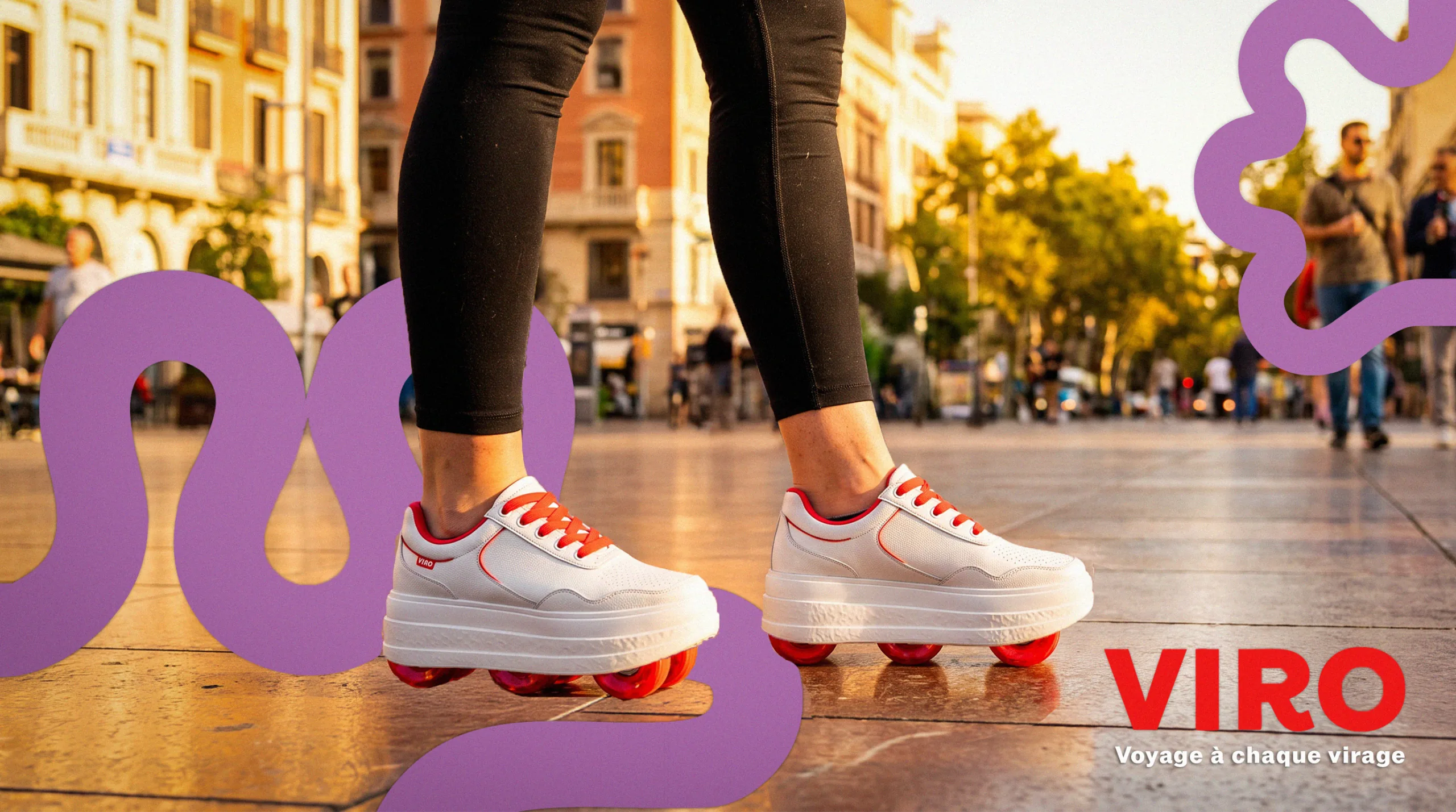
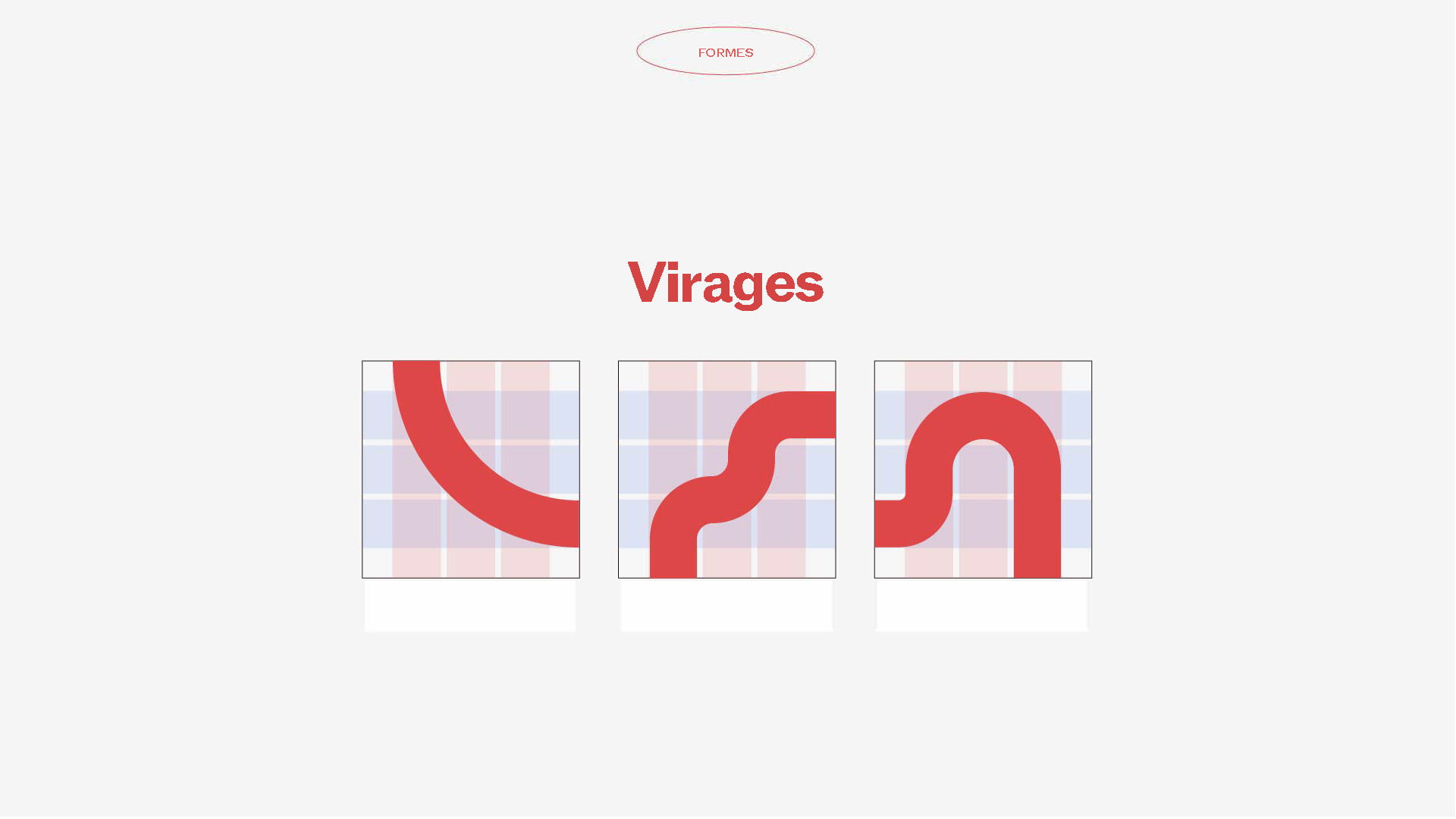
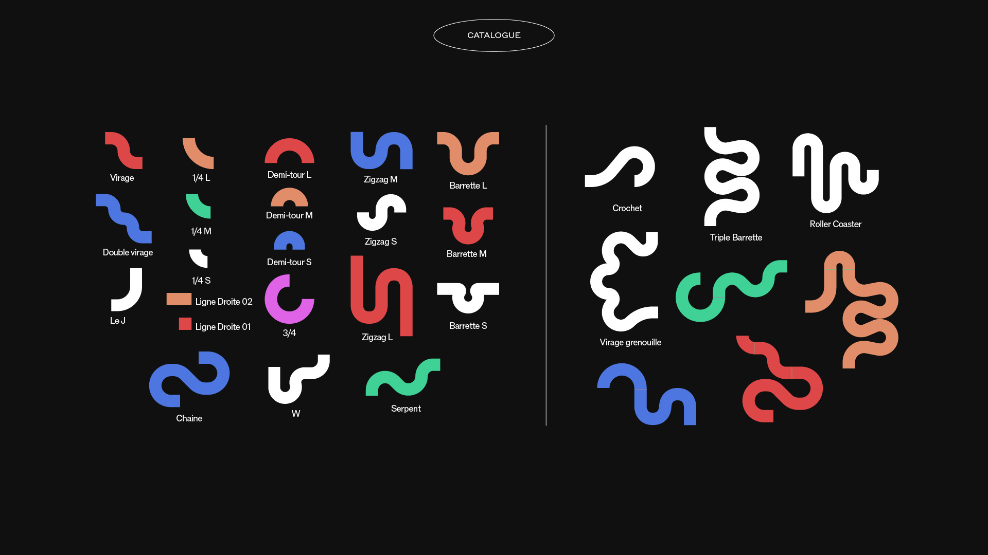
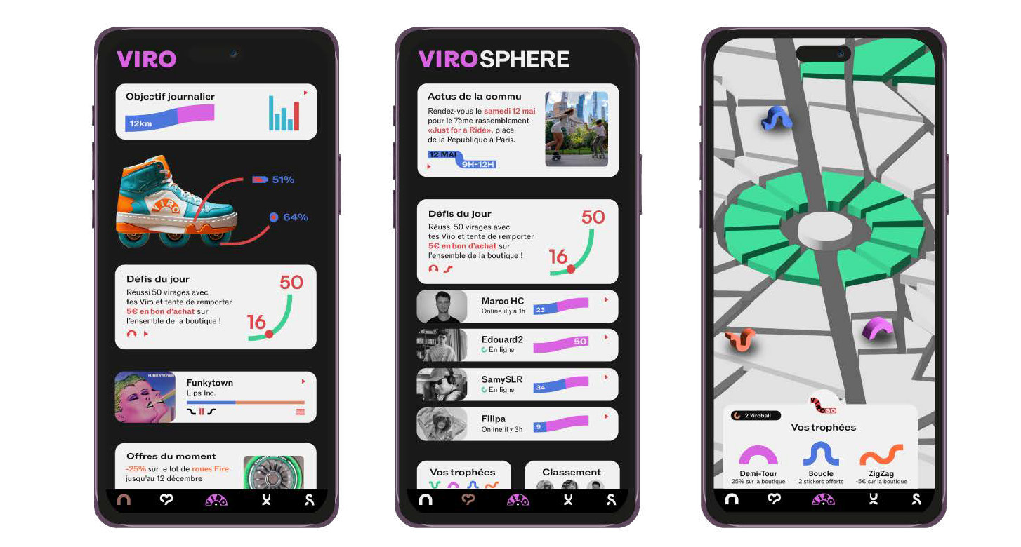
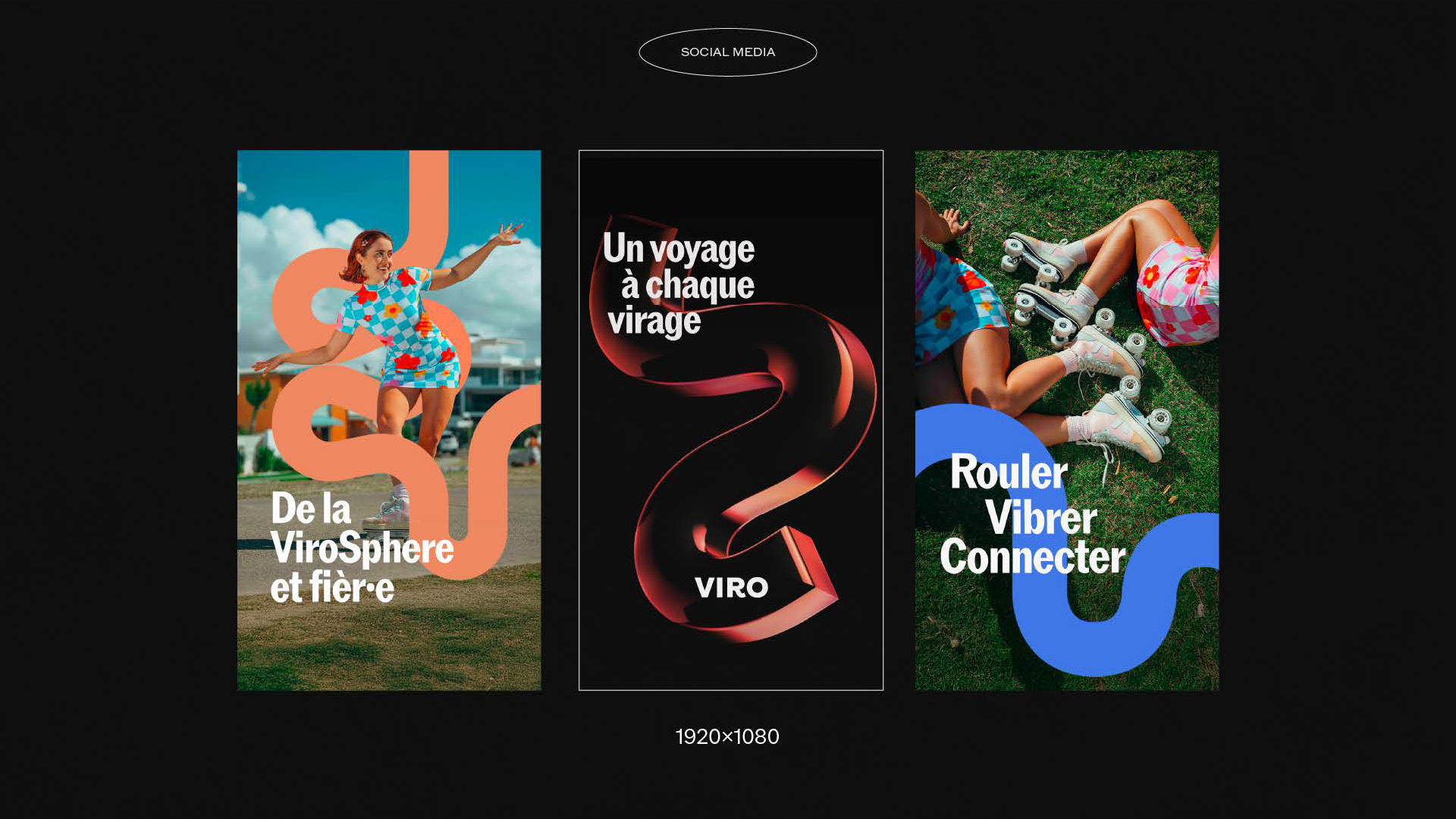
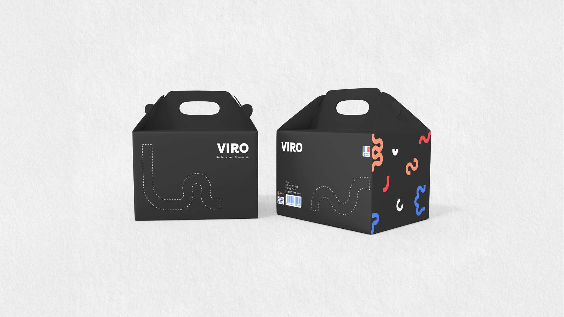
Iconography: fluid lines with no right angles, reflecting the total freedom of movement inherent to rollerskating. Rounded shapes and modular color overlaps convey the brand’s visual flexibility.
Color palette: inspired by 80s-90s pop aesthetics, featuring interchangeable tones (red, blue, green, white, and black.
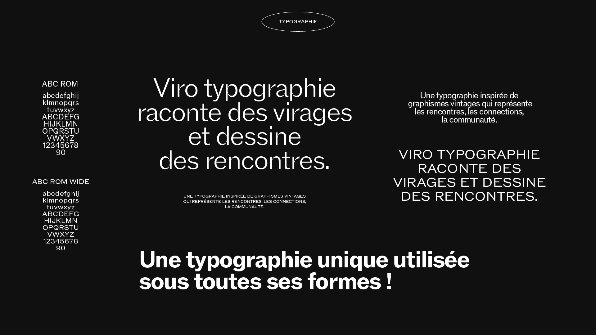
Typography: a font that “tells stories of turns and draws connections” – symbolizing community and connection
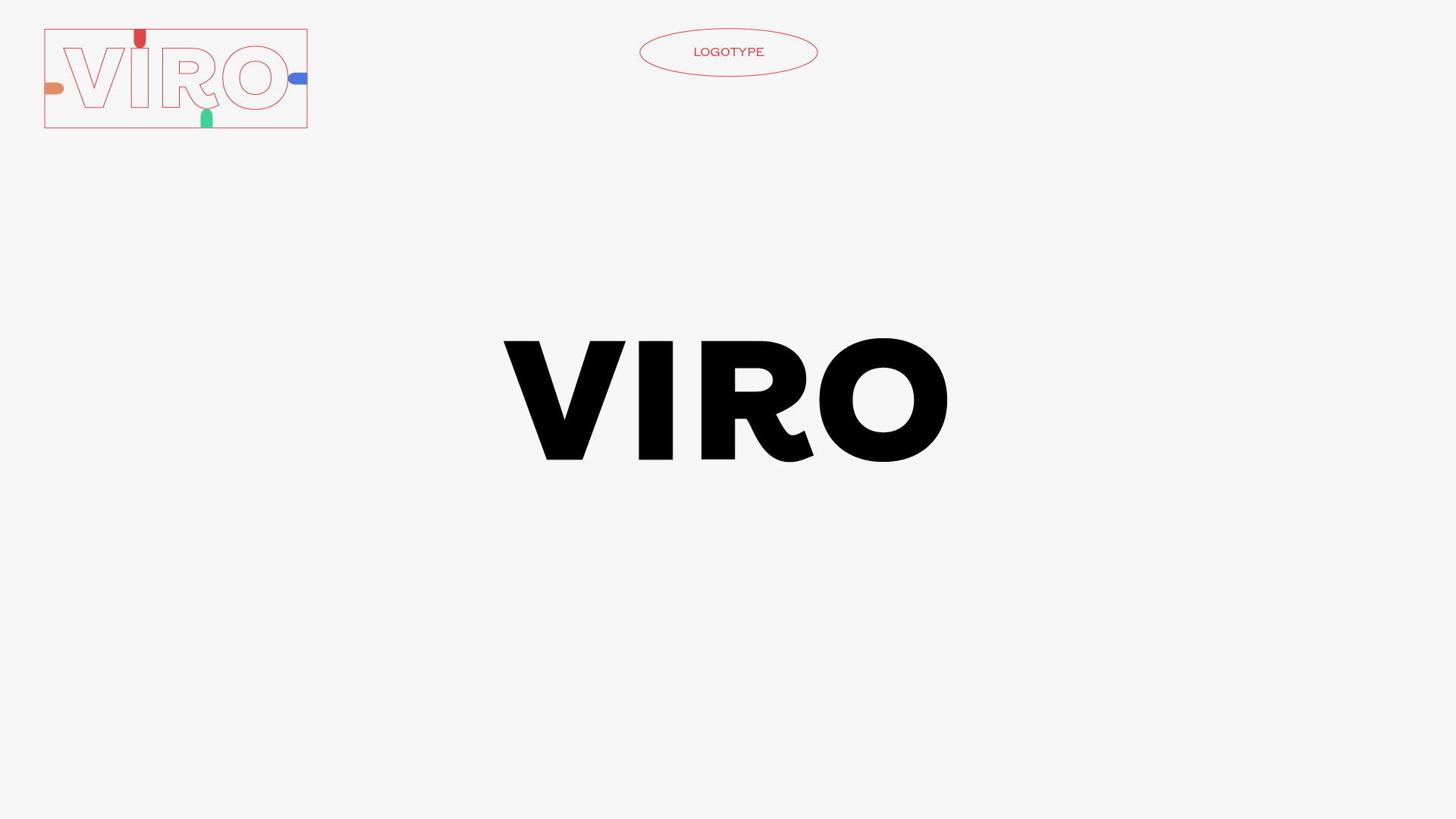
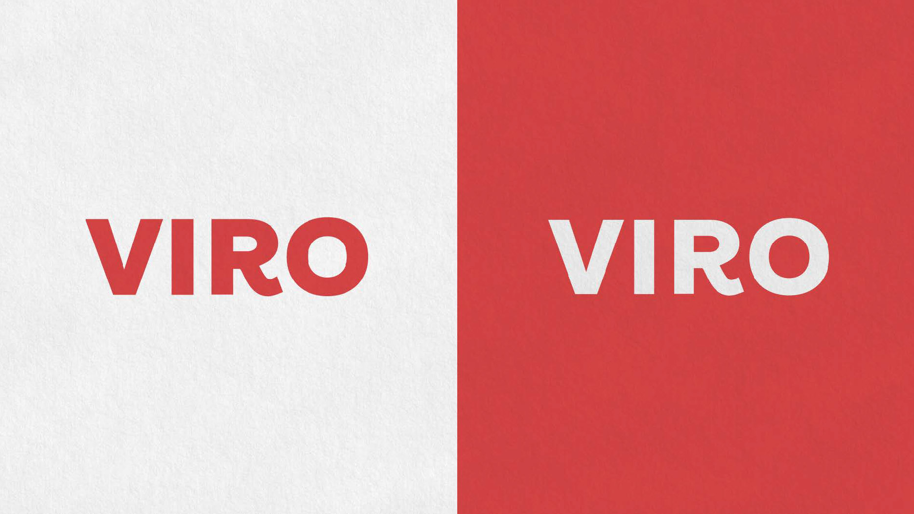
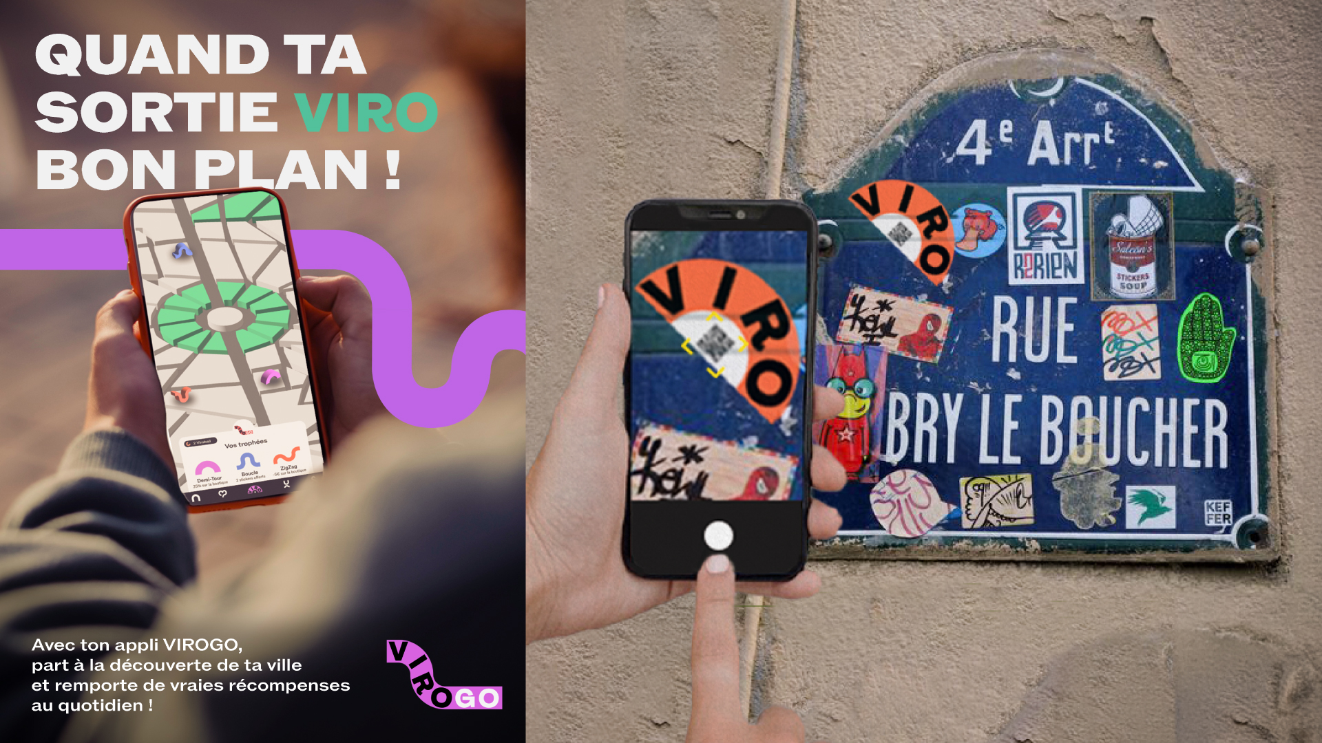
Logo: use the codes of digital applications but with a reminder of the turns on the R